A simpler page for stories on Medium
We’ve heard your feedback: A streamlined, easier-to-read page, plus more image options

Today, we’re rolling out changes to make the experience of reading and writing on Medium simpler, more streamlined, and more about what matters: your stories.
Over the last few years, we’ve made changes that added more to story pages. This was great for providing context and encouraging readers to continue exploring Medium. But sometimes less is more, especially on the story page, and we’ve heard your feedback: simplify, simplify, simplify! We’re excited to announce big changes that will help readers (and writers) refocus on reading. Internally, our nickname for this work is Project Zen because that’s our goal: a zen-like reading experience.
Here’s an overview of the changes you’ll see on your story pages. (For fun, we’ve used stories from the U.S. Fish and Wildlife Service to help us illustrate these changes!) These features have rolled out for some users already, and will be available for everyone over the next few weeks.
The beauty of white space
We’re bringing back the single-column page layout and removing the two-column layout across all stories on desktop.
You can still find recommended stories from Medium and author bios, but these sections will now be below the story, instead of right next it. This allows readers to focus on the story without any distractions on the side.

Bigger, bolder image layout options
With our new reading experience, multiple image layouts are also making a return, including the option to add full-width (or “full-bleed”) images to your stories. For an image to be full-width, ensure that it’s large enough so that it looks crisp and clear for every reader of your story—for all the technical details, see our new Help Desk article.
If you have stories that were previously formatted as full-width images, they may not automatically revert if they’ve been updated in the last year, but you can always manually go back and update them.

Focusing on your story
We’ve locked the clap, respond, share and bookmark buttons at the top and bottom of the story, so they’re no longer a distraction as you’re reading.
We’ve also simplified the buttons at the end of stories. You can follow a writer, and subscribe to their stories via email, through buttons on the right side of the author bio. If a writer accepts tips for their stories, you’ll see a button for tips, too.
For Medium writers, here’s a few more changes you’ll see: If you’ve enabled the custom subscription promotion, it will still appear on your profile and subscribe pages, but will no longer appear on story pages.
For verified book authors, your books will be featured on your profile and the Verified Book Author Badge will appear next to your name, but your book(s) will not be featured at the bottom of the page. (We’re working on new ways to highlight your books on story pages—while keeping the bottom of story pages simplified — stay tuned!)
More to discover, less clutter
There’s a lot to discover on Medium. Once you’ve finished a story, we still wanted a way to help you dive deeper — whether that’s reading more from the author, continuing to learn about a specific topic, or subscribing to a publication. We’ve made some changes to the end of story pages to streamline those suggestions and give curated recommendations the space to succeed.

We’ve combined author and publication story suggestions, and we’re also trying something new: adding recommended lists to the end of stories.
The goal is to be intentional around what we recommend, prioritizing quality stories and lists.
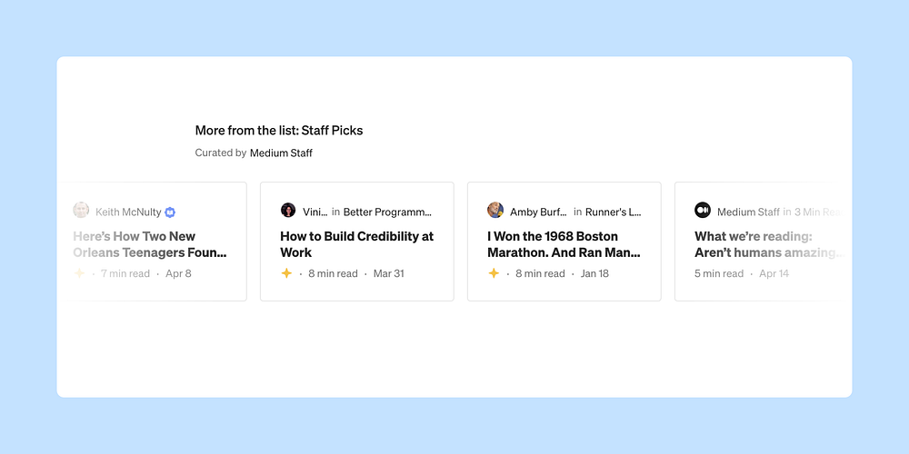
And if you discover a story through a list on Medium, you’ll see a newly redesigned More from List section that lets you continue reading content from that list.

What’s next?
Everything we design has the best interest of readers and writers in mind. Time and time again, you’ve emphasized of the value of Medium as a simple, beautiful platform for writing; we hope to bring forth that (re)focus on simplicity in the newest version of the story page.
Are there other changes you’d like to see on the story page? Tell us in the comments.


