A more expressive Medium — starting with Medium
An introduction to our evolved brand identity
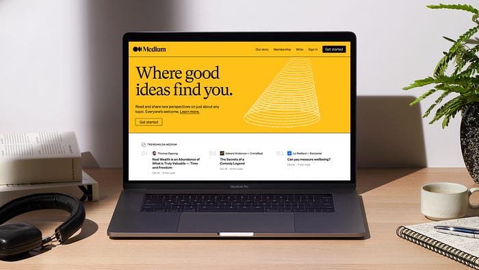
A little background
Over the past several months, Medium has been rolling out a series of upgrades, all of which are helping us build a more relational Medium.
One of the most notable upgrades we’ve made is allowing more creative expression for the writers and brands on our platform, so that your home on Medium can feel more like you. It was only fitting that as we build a more expressive Medium for creators, we should follow suit by better expressing our own brand. Which is why, this year, we updated the Medium brand identity, which we are excited to unveil today.
The foundation: the brand behind the branding
Medium started with a simple purpose: to deepen people’s understanding of the world, and spread ideas that matter. We did this by giving people a simple medium — a blank page — for their ideas to reach what is now a global community of over 170 million readers. Most importantly, as an open platform, anyone can have a voice on Medium, regardless of background, affiliation, or expertise, and share their thoughts directly, independently, and unfiltered. We’re proud to give these voices a home to grow, connect, and spark real, nuanced conversations — as well as the potential to instigate change.
While our mission remains the same, our publishing tools, reading platform, and content offering are ever-advancing to better serve this mission. As the world changes around us, we aim to create a more intentional and relational network of ideas exchange. Our updated brand identity is meant to provide a better expression of who we are, where we came from, and where we’re going.
Why now?
While our content and product offering have evolved over the years, our branding had not evolved with them. We needed an identity that better reflected where we stand today, and where we’re going. And we needed a system that addressed two important, tactical needs:
- Our previous branding didn’t have the flexibility to build and evolve. The collage illustrations were time-consuming to make — we needed a scalable system of design elements that were easier to spin up, particularly for future marketing initiatives.
- Our color palette was too pared back, subtle, and limiting. We wanted more flexibility and room for bold expression.
Our creative partner: COLLINS
I couldn’t speak about this work without first giving a huge shout-out to our partner in the process, COLLINS, the brand experience and design company based in San Francisco and New York. COLLINS has done amazing work with other next-generation brands (e.g. Spotify & Twitch). If you want to see a comprehensive view of their work with Medium, check out this case study.
The updated brand identity: overview
A brand identity is only as good as its ability to express the ethos of a brand. We believe this evolution perfectly reflects Medium’s past, present, and future
Illustration style
Very often a logo is what gets the most attention in a brand evolution. But I want to focus on the rest of the design system first.
The fundamental concept behind our new design system is language as illustration. They say a picture’s worth a thousand words, and on Medium, a thousand words can paint a bigger picture. So in this new system, we use letters and words to construct images, and each image has a unique subtext tied to the concept it’s representing.
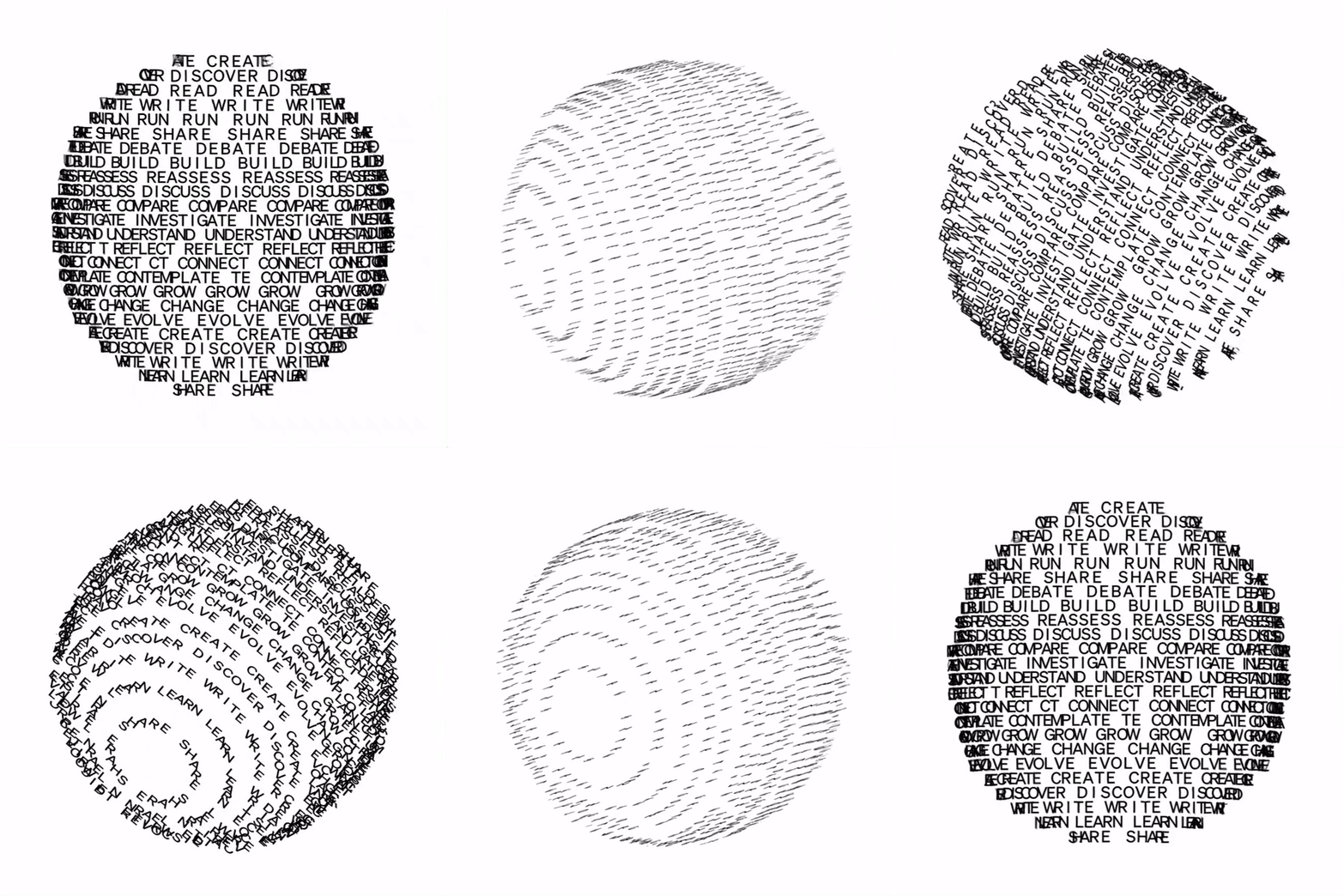

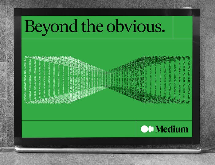
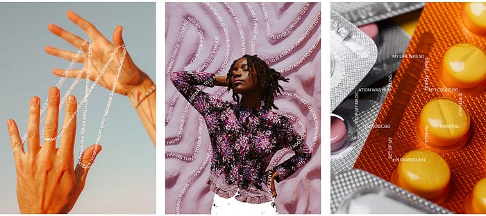
This illustration style demonstrates exactly what happens on Medium: using language to clarify and expand ideas. When I saw the initial concept for this direction, I immediately thought of how we started, and what, fundamentally, we still are for the writers on our platform: a blank page. And how it all starts is with a single keystroke: then those letters turn into words, those words turn into ideas, and those ideas take shape on Medium.
Another aspect of the concept that felt right was the dimensionality of the illustrations. As an open platform, Medium represents a wide variety of perspectives, allowing our most curious readers to explore complex issues from multiple angles. The 3-D shapes in our new graphic language are quite purposeful in this regard: they represent this range of perspectives on Medium.
Lastly, and what feels most aligned with the Medium of the future, is a sense of movement and interaction. These are not static words on a page, these are ideas that are works in progress and get set in motion on Medium. These are not mindless feeds you scroll past, but rather perspectives that stay with us, holding the potential to change the way we see the world. And when you publish on Medium you’re not publishing onto an isolated island but into active, vibrant interconnected communities and networks. They are ever-growing, too, as we continue to build more tools for people to connect with and expand their audiences.
Color
At its core Medium is still a blank canvas for other people to paint on, which we represent by continuing to lean primarily on black and white. But for marketing surfaces where we’re talking about the Medium brand, we use an expanded palette of secondary colors to represent the broad spectrum of perspectives you’ll find on our platform.

Logomark
Last but not least is the evolution of our logo.
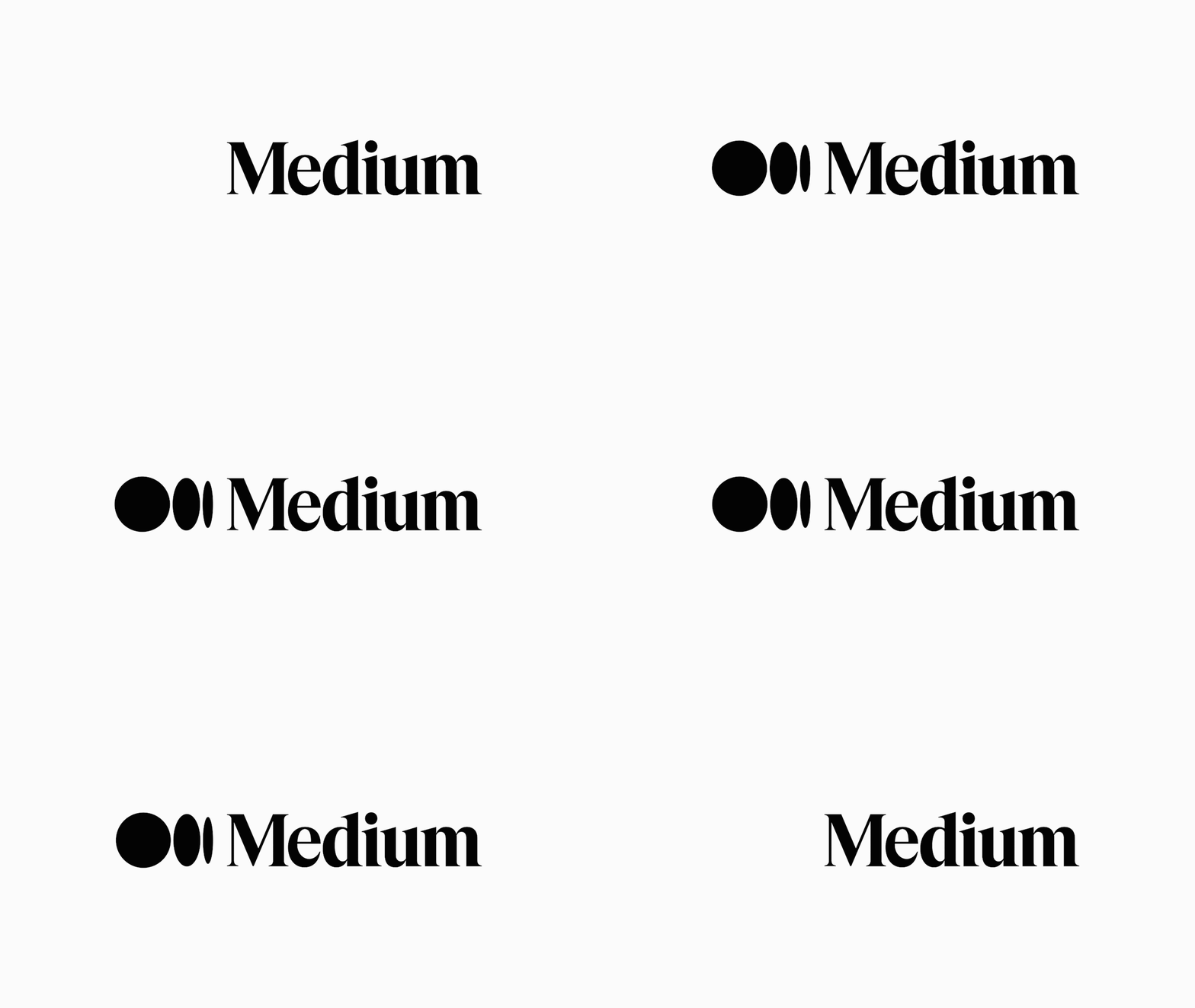
For the wordmark itself, not much has changed. We loved our old Medium logo. It felt accessible and gave a nod to our literary roots. Since we’re still the same brand, it didn’t feel appropriate to drastically change — but in the spirit of an ever-evolving Medium, we wanted to give it a polish.

We built off the strengths of our existing wordmark and customized the letterforms to feel more inviting. The lines are smoother, the letters sit tighter for improved readability, and overall, it stands prouder. It’s fundamentally the same Medium wordmark, just with a makeover.
The more significant change was the addition of a new symbol:
Why add a symbol?
- A symbol gives us more creative flexibility, another tool in the toolbox
- Medium is a platform for creators to express themselves, so our brand should never get in the way of yours. When you read on Medium, a symbol allows Medium the brand to take a backseat to let individual publications and writers shine
The symbol, like our illustration style, is inspired by language and typography. It is born from the ellipses: a punctuation mark that represents an unfinished or impending thought, an idea to come, what’s next. This is, again, what happens on Medium — there’s always a new idea, always more to the story.
The future: what’s next
The updated brand identity is just the beginning. Now that we’ve built a more expressive Medium, we’re eager to use this new language to build better and deeper relationships with readers and writers around the globe.

